The dictatorship of consortia
on the media they own
CS-401 Applied data analysis project 2021
One's view of the world is based on the information we have on it, and how it is conveyed. We obtain a big part of that information throught mainstream media, and in particular newspapers such as The Guardian or Fox News. As a result, the media has a huge impact on the public’s opinion and can lead to a polarization of opinions. One way to ensure you are well-informed (i.e. you are getting information on various topics) and are not biased towards a particular instance is to gather knowledge from diverse sources (e.g. several media). However, a lot of the media is owned by the same groups and might have converging opinions. This begs the question whether the information we are getting really is diverse, or if the news and opinions published are roughly the same for media belonging to the same entity.
The following video is evidence of such a bias for the Sinclair broadcast group, and we will try to obtain similar observations for more groups.
Are the quotes from news articles sufficient to cluster newspapers by their owners?
We aim to show that it is possible to cluster newspapers by the media group they belong to, using only quotes cited in a media and the people who spoke them as information. Therefore, we will have shown that a diversity of journals does not necessarily imply a diversity of information sources, thus showing that if you want to be well-informed, simply reading different newspapers is not enough.
A sketch of our journey:
We first need some features which may allow us to distinguish between different media. To do so we use the Quotebank dataset, which is a dataset of speaker-attributed quotations that were extracted from diverse English news articles over the period of 2008 to 2020. Due to the sheer scale of the data as well as the great variation of topics over the years, we choose to focus our study on 2020. The resulting dataset contains over 5'000'000 unique quotes and 7'000 newspapers, a normal human wouldn't be able to comprehend all this data unless using ADA techniques.
Since this dataset does not contain all the data we need –such as the media group owners, or the country of origin of the journals– we augment it using an open knowledge base, Wikidata.
Then, we use NLP techniques to construct TF-IDF matrices –a better representation of our data, which we detail later– with the features.
Finally, we project our results –again, more details later– in a 2D-space to visualize and analyze them.
A note before proceeding:
For this whole blogpost, we will interchangeably use the terms newspaper/media/journal, and quotee/citee.
Let's dive into the data
The data we get from the Quotebank-dataset look like this :
data.head()For now, our only way to identify in which newspaper a quote was published is the url where the quote was discovered. To be able to characterize clusters of newspapers, we need to extend our datasetwith the newspaper's entity, as well as the media group owning it. Because we expect to see media differences based on their country of origin, we also add the home country of the media. Using our best scraping skills we query Wikidata to add those features. This comes at a cost, because not all newspapers have a Wikidata entry and of those, not all have a media group indicated. As a consequence, the reduced dataset contains around 1'000 newspapers which reduces the diversity of our data in exchange for more insight on each data point. Single journals in a group were also removed because they would be irrelevant to our goal to cluster them according to their parent group.
newspaper_info.head()Now that we have the data we process it
Since for each sample, we have both quotes, and quotees (i.e. the people quoted), it seems natural to try and cluster journals according to these two features, and some measure of their similarity. Let us then try two different methods:
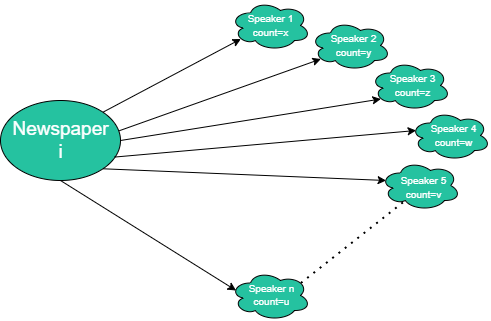
- First, we will cluster newspapers according to which speakers are cited in it.
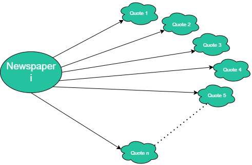
- Secondly, we will cluster newspapers according to the text content of their quotes.
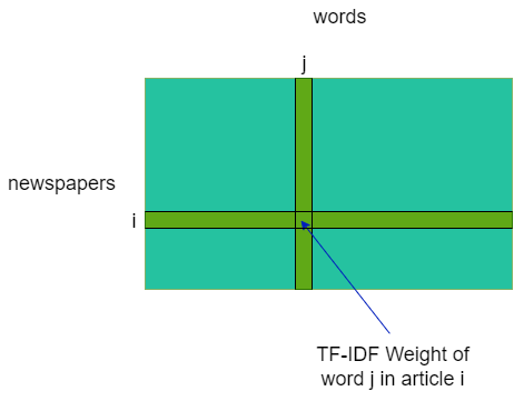
For both of these features, we created the associated TF-IDF matrix, namely a matrix [newspaper x speaker] and another [newspaper x token]. In a nutshell, this method allows one to measure the importance of a term (here a citee, or a word) to a document (here a media) in a collection (here, all the media we have kept) based on its number of apparitions. To do so, this method gives to each word in a document a weight proportional to its number of occurrences in document (TF: Term Frequency) and inversely proportional to its 'presence' in the corpus (IDF: Inverse Document Frequency). To quantify the 'presence' of a word in the corpus, we simply count the number of documents in which it occurs –we don't take its occurrences per document into account here.
TF is used to give importance to words that appear often in a document, as they may be characteristic to this document. For example the word 'brain' may often appear in a neuroscience paper, while not so much in a geography one. On the other side, IDF prioritises words unique to each document, or remove recurrent words, which we find in basically every document, and therefore do not bring any information (e.g. stopwords such as 'the' or 'a' in a text).
These matrices give us a representation of the newspaper in the words and speakers spaces. The problem is that the data (our TF-IDF matrices) is inherently high-dimensional (speaker: ~210'000 dimensions, words: ~260'000 dimensions), so we as humans can not directly visualize it, even computers struggle to run cluster algorithm in these dimensions.
How can we analyze data which lies in such a high dimension?
In order to tackle this challenge, we will project the newspapers in a lower dimension space using Singular Value Decomposition (SVD).
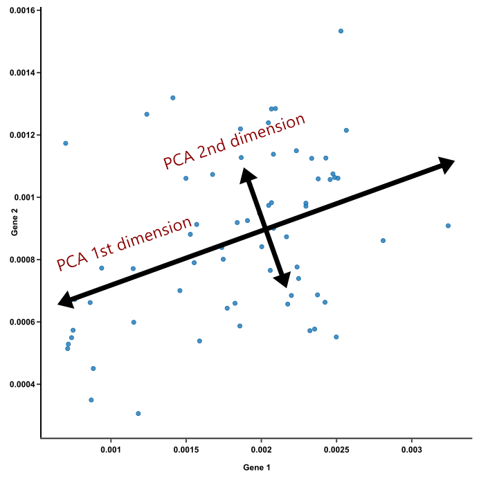
This transformation should allow us to extract topics, which correspond to the directions of highest variation, i.e. the ones separating the media the best, and their importance. We can then view the differences between different media along one such axis. Refer to our notebook for more technical details.
Example from a very similar dimensionality reduction technique named PCA. We keep the axes where the variance is maximal because there lies the most of the information.
Let us apply this technique on the speakers matrix first
Each of the following plots represent a projection of the media (as represented in the speakers TF-IDF matrix) along some of the axes mentioned above. The x-axis corresponds to the first axis mentioned in the legend, and the y-axis to the second.
Each point corresponds to a media, and its color indicates the group owning it.
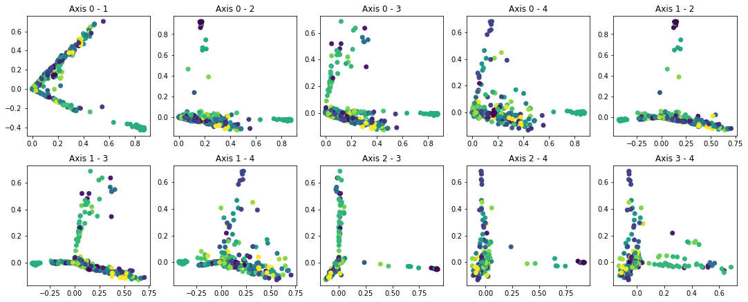
By applying SVD on the speaker TF-IDF matrix and looking into the speakers contributing the most to each axis, we identify the following trends for each axis:
Conclusion
From all these projections we have found 3 types of media:
- Media belonging to some groups –e.g. Townsquare Media– are clustered together on some axes x and y, and are therefore easily identifiable.
- There are also media belonging to a group which we can't as easily uniquely identify, for example because they are part of a few-colored (e.g. bicolor or tricolor) cluster. Still, we can exhibit a trend on these few groups, since they are clustered together.
- And finally, there are a number of groups which we have not managed to visually separate through these 2D-projections –see groups whose media are always split all over, or in the middle of some big blob, e.g. Hearst Communications. Refer to the Bokeh plots to see this well)
The fact that a process as simple as ours is able to exhibit media of groups 1 and 2 mean that these media have obvious bias which is correlated to the group to which they belong. This bias may be speaker-wise, where some people are put upfront more than they should, or word-wise, where some subjects are brought up more than they should, or opinions supported excessively.
In any case, if an unaware viewer gets their information from media in this group, whether one or several, they are bound to be biased too.
Note: we deem our process as simple because:
- It uses very little information, namely only
- the names of the people quoted in articles of the media
- or the words used in all quotes in articles of a media, seen as a non-ordered set. which furthermore is easily accessible; you can get it either by yourself, or using some preexisting dataset such as the one we used: Quotebank.
- The algorithms on which it relies are conceptually relatively simple, which we described earlier:
- the TF-IDF transformation, which we explained earlier
- the Singular Value Decomposition.
Potential caveats and overall outlook
Some pitfalls that may have occured:
While our analysis made some biases clear, it is deeply linked to the dataset we used –here, Quotebank. That is why it is important to know how the latter was generated. We advise one uses data that has been reviewed either by a neutral authority or by the community. This a paramount parameter as indeed the saying claims: "garbage in, garbage out".
Future work:
A first step would be to better the visualizations: for now we limit ourselvers to projection along the axis found by SVD, and therefore only illustrate distanciations along a few axes. We could instead try to find some representation taking into account the distances between media along all their axes..
Moreover, we could proceed to more semantic analysis for quotes (better than simple bag/set of words) e.g. by using advanced techniques such as deep learning for NLP which would effectively procure deeper information but as a tradeoff would be heavier computationally to do.